The dark side of minimalism: Balancing product info and negative space design on cheese pack concept

10 Mar 2021 --- Minimalist packaging designs are trending but F&B products still need to incorporate enough visual elements and on-pack messaging to connect with consumers on-shelf.
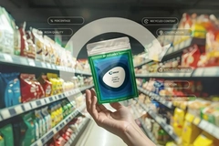
Russia-based design agency Commersart struck precisely this balance with its latest negative space design concept called Blue Moon cheese.
“A big disadvantage in minimalist projects is the designer removes almost all design elements. As a result, it becomes hard to perceive the product and the task the packaging should perform,” David Oganesyan, art director at Commersart, tells PackagingInsights.
The balance lies within conveying the product’s essence in small graphic details without sacrificing form or information for the sake of beauty.
The moon is made of cheese
While negative space designs are generally in demand – and particularly popular for tattoo designs – they are still somewhat of a novelty in FMCG packaging.

The yellow packed slices mirror moon craters, long known as a humorous metaphor for cheese in popular culture.The cheese made visible through the crescent-shaped packs resembles the moon, a recognizable visual image-comparison and long-time “humorous metaphor” for cheese in popular culture.
Commersart further matched the moon motif with a deep midnight blue background.
“In addition to the semantic designation of twilight, it creates a simple, laconic background against which the cheese stands out clearly and is easily read,” Commersart affirms.
Oganesyan’s personal favorite detail is the “lightness of the project, the easily conveyed idea of the concept.”
“I was convinced again that people choose a product emotionally, not rationally,” he concludes. “A smile appears on the face when we see something familiar on the shelf.”
By Anni Schleicher


