- Industry news
Industry news
- Category news
Category news
- Reports
- Key trends
- Multimedia
- Journal
- Events
- Suppliers
- Home
- Industry news
Industry news
- Category news
Category news
- Reports
- Key trends
- Multimedia
- Events
- Suppliers

With gourmet bottles, mineral waters started a new departure in the catering trade. We look at some new trends in bottle packaging.
With gourmet bottles, mineral waters started a new departure in the catering trade. For years, people got hot and bothered about the standard bottle for beer and water. What seemed to be a good idea for the handling of returned bottles proved to be unfavourable at the point of sale: it was difficult to distinguish between the various products at first glance. Thus, the mineral waters industry dared to differentiate bottles.
For decades, the bead-covered bottle by Günter Kupetz dominated the mineral water market, but then new bottles were developed for the catering trade, spearheaded by Apollinaris, which gave restaurant patrons the feeling of drinking a very special water. This makes them willing to spend that little bit more on it. Designer Peter Schmidt of Hamburg created the crystal clear bottle for ‘The queen of table waters’ with its unique font and the red triangle. After years of purism, during which design and packaging had been dominated by waste optimisation, the gourmet bottle for the catering trade was a development allowing not only the glass industry to prove its skills but also consumers to enjoy new designs. Regretfully, however, the finely shaped bottles did not become available in supermarkets or drinks shops immediately. After all, consumers wanted to indulge in something special at home, as well.
This is a good example of a market that had hardly moved for decades, and in which few changes could have been expected, suddenly developing a new perspective. Consumers are now well used to the various bottles that can immediately be associated with a water brand. Packaging as a marketing tool has shown where its strengths are: to give products the face that reflects their character. The numerous waters that are being launched or have been launched on the market with the additional wellness feature, benefit from differentiating bottles – some of them made of PET – allowing them to place their products not only with a unique design but also with a distinctive shape.
Snappy packaging for modern drinks
It is not only the water producers that have long since recognized the strengths of packaging, though; manufacturers of new mixed drinks with alcohol also make use of striking shapes or designs. They come in a classic or trendy design, depending on their target group, with the label often playing a crucial role for branding. For a relaunch, the label is more likely to be modified than the shape of the bottle, as this is the more economical approach.
How to develop a successful, trendy drink is shown by the PR agency Holdgrün from Hanover, who designed two successful products, Cool up and Youwell. Fruit wines and beverages containing fruit wine are not exactly hip. Fruit wines with their usually overladen labels printed with golden fonts do not appeal to the younger generation. For market leader Dr. Demuth this was a reason to address the issue of a fruit wine drink for young target groups in co-operation with Christa Holdgrün and her staff. The first result of that co-operation was Cool up. The name of this new fruit wine cocktail was developed by the agency. Not only the transparent (standard) bottle that allows consumers to see the contents, which have different colours depending on the flavour, but also the flashy logo with the colourful, stylised sun on a transparent label – the so-called ‘no-label’ look – give this drink an entirely different appearance. Sales figures that increase every year and ever new flavours indicate the success of this drink. In addition to developing new target groups, the uniqueness of this summer drink was a precondition for its success. Although it is somewhat more expensive than other trendy drinks, it was among the most successful market launches of the year 2001.
Youwell has been a similarly successful story. In the first four months after its launch, more than one million bottles of this lifestyle drink of fruit wine and yoghurt were sold, without traditional forms of advertising. A white frosted standard bottle for sparkling wine was used. After all, Youwell targets successful young adults, who want to afford something special, and at the same time healthy for their Sunday brunch. Depending on the flavour, there is a pink or apricot sheen to the contents, giving the consumer the feeling of having purchased a premium product. A silver cap, normally used on sparkling wine bottles, and a fresh and fruity label underscore this impression.
Packaging and advertisement in one
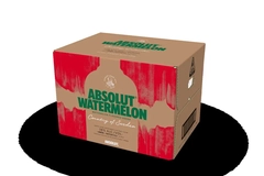
Another outstanding success story, where the packaging plays a vital role, is that of Absolut Vodka. The mere mention of the name is enough to evoke an image of the bottle. At least in Germany, this name is practically unmistakable and unambiguous. The designers also managed to combine packaging and advertising. The unique shape of the bottle, ink applied in silk-screen printing, and a different colour for each flavour; for example, yellow for Citron or orange for Mandarin; these features recur in many variants throughout the advertising campaign. Whether it is a city or an artist that endorses the brand, the name and shape of the bottle are always shown so that there can be no doubt about the product. The marketing of Absolut Vodka is among the most original and unambiguous campaigns in that the bottle is always shown in such a way that the product can be clearly recognized on the shelf.
Duty free as an upmarket testing ground
If you look around at the trend exhibition Tax Free World, which takes place once a year, you will also find wines and high-end spirits. The duty free trade is often used as a test market for new concepts. Here, branding can be especially upmarket. The finest brandies and best cognacs are presented in bottles with sumptuous stoppers and in precious caskets. In the world of luxurious products, the price of packaging plays a minor role, given the high value of the contents. The comparison with delicate bottles of the most expensive fragrances, whose packages are veritable pieces of art, suggests itself. Inclusion of a refined folding box as secondary packaging is a matter of course.
In this context packaging manufacturers are currently discovering premium packaging as a new field of activity. Thanks to their printing facilities, virtually all options technically possible are available to them, but they have not been used in the past. However, it is not enough to have the machines required to produce high-end packaging; it is just as important to position the company with new processes or developments. If you wish to enter the premium market you should step onto that stage well-prepared.
The examples shown indicate how new concepts can achieve a good and successful launch if supported by packaging as a marketing tool. If product quality and branding match the package, the first step to success has been taken.
