Wild, sacred cans: Siesta Brewing Co leverages storytelling trend to engage beer drinkers


29 Jul 2020 --- While experimenting with new flavor profiles in its recently unveiled limited edition product line, Spanish beer brand Siesta Brewing Co incorporated “wild, sacred, imaginary and funny” imagery within its canned beer label and graphic system. The brewer aims to make each anecdotal packaging something “unique and collectable – a challenge to imagine and create.”
“To create this project was a very natural step after designing their entire brand identity and core line beers. The entire process from idea to art working took about three to four weeks. Fortunately, no redesigns were made. It was pretty straightforward. While designing their entire brand identity, brand language and core line beers packaging, I was already considering how the products could be based upon collaboration, so I already had some ideas in mind,” Luis Utrillas, designer of Siesta’s label imagery, tells PackagingInsights.
“I presented [the client] the design system for the product line: a storytelling idea, beer naming, and a sketch that supported it and would give them a clear idea of how the packaging was going to look and they loved it. From there was only about crafting the ideas.”
Siesta’s logo character is integrated within its bright yellow, black, pink and white beer packaging design as part of its dynamic brand storytelling.
FMCG brands are increasingly acknowledging visual communication through product packaging as a key selling proposition of consumer packaged goods. Innova Market Insights identified “Storytelling: Winning with Words” as its top food and beverage trend for 2020, in which packaging has become increasingly integral to brand-consumer relationships.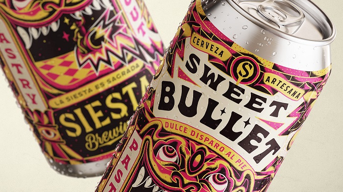 Siesta Brewing Co incorporated “wild, sacred, imaginary and funny” imagery within its canned beer label and graphic system.
Siesta’s logo character is integrated within its bright yellow, black, pink and white beer packaging design as part of its dynamic brand storytelling. On its cans, a man in a sombrero – “a reflection of the consumer” – is seen riding a rocket through the teeth of a colorful monster and into the shimmering void within it. The company’s Sweet Bullet, Dulce disparo al Pie (“Sweet shot to the foot”) is a pastry stout that celebrates one of Siesta’s local dessert flavors, La yema de burgos.
“We wanted to highlight a unique anecdotal meaning behind each beer. In this case, it was about drinking a wild beer and [highlighting] how pleasant that is – a sweet shot to the foot,” details Utrillas.
“Once the main idea was determined, the process was based on imagining the entire story and how the elements could coexist and interact with each other throughout the packaging, telling different things about the product and leading attention to Siesta’s iconic character and making him the design hero and story protagonist. It’s all about storytelling.”
Sacred visuals on-pack
The craft beer category leaves ample room for creativity. “Something I love is that it feels very open. It can take many kinds of shapes, expressions, concepts, and executions. For me personally, a successful packaging-label design is when it's telling a unique story, and it is also excellently crafted. Something that stops your gaze when you look at the shelf and stands out against its competitors.”
“In this case, it has been graphic language and illustration. But I think that a story can be expressed in infinite ways. In graphic language, this ranges from a variety of shapes, print finishes, materials, selected stock or the product substrate and format.”
The design is inspired by the Spanish word describing the “sacredness” of taking naps, Utrilas notes. “We imagined the product as a sacred pleasure of life, interpreted through Siesta’s spirit lens by the inclusion of rebel cues, color pops and symbolic scenes.”
“A unique signature is created by the celebration of a very ownable occasion for their brand, and the use of a distinctive character, graphic language and bold fluor colors that will make it easily identifiable,” he concludes.
The aluminum can, which has been popular in beer and soft drinks for decades, is expanding its creative reach. This can be attributed, in part, to its versatility in design, shape and size, while its material is achieving impressively high recycling rates in Europe. Last year, PackagingInsights reported from the show floor of BrauBeviale 2019 in Nuremberg, Germany, which spotlighted the explosion of new beverages pushing packaging NPD to new levels of design appeal and consumer engagement.
By Benjamin Ferrer