


Packaging sector advances accessibility through inclusive design


Key takeaways
- Inclusive design is becoming a core pillar of packaging innovation, moving beyond niche projects to improve accessibility for consumers.
- Amcor focuses on designing closures and packs that are safer, easier to use, and more intuitive for a broader range of people.
- Tilt Beauty and Etia are tackling accessibility in the beauty sector, offering easy-to-use cosmetic packaging.

Packaging industry leaders and advocates are emphasizing that the concept of an “average” consumer does not account for the diverse needs of millions living with disabilities, chronic pain, or visual impairments. For these individuals, everyday tasks such as opening a bottle or identifying a product can be challenging.
Packaging Insights speaks to Amcor, Tilt Beauty, and Etia about how inclusive design is moving from a niche “special project” to a core pillar of packaging innovation strategy.
Frederic Chave, R&D director for Food and Beverage Closures at Amcor Global Rigid Packaging Solutions, tells us: “Inclusive design helps us create closures and packs that are easier, safer, and more intuitive for a wider range of people — and this translates into better user experience, stronger brand trust, and more effective innovation overall.”

Accessible beauty packaging
In the cosmetics sector, the push for inclusive packaging is personal. Aerin Glazer, founder of Tilt Beauty, started her company out of necessity. Growing up with psoriatic arthritis, she found herself constantly modifying makeup products that weren’t designed for people like her.
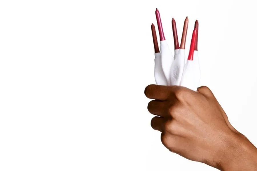 Tilt Beauty aims to develop solutions that are easy to open, hold, and apply (Image credit: Tilt Beauty).“I realized there was such a clear gap in accessibility within beauty,” Glazer says.
Last year, Tilt Beauty launched in the US to make cosmetic packaging accessible for people with disabilities. The brand introduced the Lashscape Mascara and Grip Stick hydrating lip treatment, designed to be easy to hold, open, and apply. Tilt Beauty also features the Braille Institute’s Atkinson Hyperlegible font across packaging and website to support individuals with low vision.
“From the beginning, our core consumer has been anyone who hasn’t felt considered by traditional beauty, whether they live with chronic pain, disability, highly sensitive skin, or simply find conventional packaging difficult to use.”
“It’s been important to me that Tilt Beauty feels covetable, not clinical. I’ve always wanted the brand to feel joyful, elevated, and like a brand anyone would be excited to have in their makeup bag,” shares Glazer.
Meanwhile, Lucy Edwards, founder, blind broadcaster, and disability activist at beauty brand Etia, tells Packaging Insights about the need for a shift in how products are identified. She explains that for the visually impaired, the “visual-first” approach in packaging design is a major barrier.
Edwards highlights the importance of adopting smart labeling solutions to strengthen inclusivity, such as NaviLens Accessible QR codes for blind and visually impaired users.
Real-world solutions
Terry Patcheak, vice president for Core R&D at Amcor, says that the challenges faced by consumers with disabilities can be invisible to people without disabilities.
“One of the key challenges for consumers with disabilities is how to easily and safely access a pack and reclose it successfully. Inclusive design has therefore become a key driver in our design process because it directly impacts this first and most critical of user interactions,” says Patcheak.
To solve this, Amcor is designing for real-world variability, focusing on individuals with reduced grip strength, such as children or the elderly, or those who can only use one hand. The company recently partnered with French premium water brand Wattwiller to introduce a flower-shaped cap that supports consumers with limited dexterity.
“With our closures, for example, we’re engineering versions with lower opening torque, larger and more ergonomic profiles, closure knurl patterns that improve grip, and clearer tactile and visual cues to make them intuitive, while at the same time ensuring that there is no compromise in sealing performances,” Patcheak shares.
“For tamper-evident closures, we ensure an audible break and a change in resistance form, which provide feedback and confirmation that the tamper-evident band has been broken.” For ease of use, Amcor’s closure is designed to enables intuitive one-handed opening (Image credit: Amcor).
“Similarly, our design and material choices support safe and intuitive use through features, such as ergonomic grips and handles on bottles that help guide the correct pouring direction, lower centers of gravity to reduce the likelihood of packs tipping over, and improved drop‑impact performance to better withstand accidental drops.”
Improving safety
Chave also shares that Amcor is focusing on balancing accessibility with safety. Last year, the company introduced tamper-evident sports caps to enhance the recyclability of children’s drinks in Austria.
He says that Amcor’s sport caps are designed to ensure safe and comfortable on-the-go consumption, simplify the process of opening products, and comply with regulatory requirements.
“It’s also influencing how we approach sustainability. As we continue to lightweight closures and packs and introduce more monomaterial solutions, we ensure usability isn’t compromised, which is critical for consumer adoption,” Chave adds.
Patcheak tells us that Amcor will continue to improve its existing ranges. “Customer and consumer feedback are an essential part of this because the more we understand the specific challenges of different end-users, the better able we are to devise appropriate and workable solutions.”


