

Pearlfisher invites US saké food-pairing rediscovery with SoGood Saké redesign

 (All image credits: Pearlfisher)
Design agency Pearlfisher has created a brand design for SoGood Saké to help establish the traditional Japanese alcoholic beverage beyond just the US restaurant scene.
SoGood Saké is a US-made saké aiming to jumpstart the category by promoting new occasions and food-pairing experiences.
The new identity and design system tells a vibrantly layered and symbolic story of the rice-derived drink, playing to both traditional craft and the idea of discovery.
“We discovered that for so many people, rice is an extremely versatile ingredient – spanning the world and cuisine. If rice is so versatile, surely we can get people to understand that saké is versatile as well,” Jon Vallance, executive creative director at Pearlfisher – San Francisco, tells PackagingInsights.
More than a restaurant beverage
Despite being the oldest-known alcoholic beverage in the world, saké is still in its infancy in the US market. Saké is steeped in the tradition of its Japanese roots, as evidenced by the visual storytelling and typography common to most saké labels.
However, in the US, this strong association with tradition has perhaps created a habit of only enjoying it in a sushi restaurant setting. To bounce saké out of the restaurant scene, new associations and emotional triggers were needed.
“Creating the brand was about telling a simple story that made saké more approachable to the US consumer. Maybe a person doesn’t go to the beach and think ‘Corona [beer].’ Instead, they think ‘saké,’” adds Peter Geiszler, strategy director at Pearlfisher.
“We wanted to create something that was respectful of saké heritage and tradition, while in a way distancing ourselves from the typical visual cues that US Americans have come to expect.”
 The “saké” logo was designed to be written larger and, therefore, easier to notice and navigate.Creating a relaxed, West Coast vibe
SoGood Saké produces two types of premium saké: Ginjo, a premium variety and Daiginjo super premium, according to the company.
Given their respective milling processes, the Ginjo and Daiginjo variants have “complex stories,” says Vallance.
Therefore, Pearlfisher included explanations on the bottles’ labels where flavor profiles and product descriptors help to unlock the category for consumers.
“Our clients are rice farmers. Their ownership within the category comes from generations of hands-on production of the key ingredient in saké. This is one of the biggest reasons why we featured the rice on the labels,” Vallance reveals.
The rice grain’s versatility is not limited to its production. It serves as an accent over the “e” in saké, while doubling as a surfboard to communicate a “relaxed, West Coast vibe.” The horizontal golden lines resemble ocean waves, but also draw parallels to golden fields of rice.
The setting sun symbolizes the milled grain of rice after fermenting saké, known as the pearl. This scene and the saké story inform the sunset and gold colors of each bottle. The back label provides details of the beverages’ milling process.
“Once we realized our key ingredient strikes a chord to the very heart of the brand and the product while also holding such a vast story visually, we didn’t have to think about anything else,” Vallance notes.
Choosing the color palette
The colors were designed to resonate with an American audience. “We used red to denote the Ginjo and blue to represent the Daiginjo, but these colors come together across the branding and give a subtle nod to the American flag,” Vallance explains.
“We loved the idea of using color in the label designs to denote occasion,” he continues. Ginjo’s red label can be enjoyed at sundown while Daiginjo’s blue label sets the scene for moonrise.
Meanwhile, the gold accents tie the red-white-and-blue theme in with the rice farming heritage. “The clients, who are rice farmers, always talked about the product itself having come from these incredible fields of gold,” he details.
“This story is brought in by the use of gold, while also tempering the design and providing premium cues.”
New beginnings for US saké?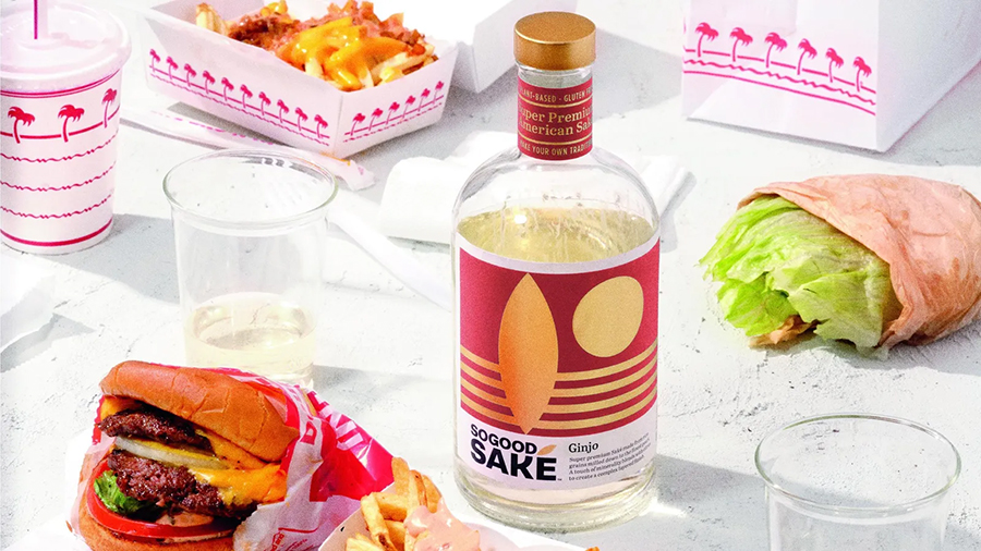 Despite saké’s craft and quality, Vallance concludes there is sadly a language barrier in the US market when it comes to getting to know saké brands.
“I was surprised by how untouched and somewhat overlooked the category is. Especially for a product with so many benefits, like being plant-based and gluten-free,” he affirms.
“I was also pleased with how well the theory of new pairings and occasions works in practice. In the end, SoGood Saké paired perfectly with so many types of cuisine from pizza to burritos. I’m excited to see saké break out of bounds going forward.”
By Anni Schleicher