


China’s menstrual care brands refine packaging to boost shelf differentiation


Key takeaways
- Menstrual product packaging can balance aesthetics, functionality, and sustainability, with Chinese brands often prioritizing consumer expectations and market trends.
- Designers are increasingly using eco-friendly materials while maintaining product safety and appeal.
- Brands are building connections and resonating with evolving perceptions of women’s health through packaging.

In East Asia’s fast-moving consumer goods market for women’s menstrual products, there is a wide variety of packaging formats. To stand out on the shelf, it’s important to align with brand identity and appeal to target audience preferences, says Longhui Liu, a designer at Xinshijiao Creative Design Studio (Draw Studio) in China.
Packaging Insights speaks with Liu about her packaging design work for several Chinese menstrual hygiene brands, including SenseOF and Mian Mian De Yang. Her portfolio includes designs for products such as disposable tape-on underwear and sanitary pads.
“Balancing functionality, sustainability, and aesthetics in hygiene product packaging design often involves market trade-offs and design compromises. In the projects I have worked on, a common challenge is that while a concept may be strong, brands tend to focus more on consumer expectations or what they perceive as market demands,” she says.

“Every client has a different set of ideas, so our work is a collaborative process where we co-create designs with each brand.”
Eco-friendly options
.webp) Longhui Liu, a designer at Xinshijiao Creative Design Studio (Draw Studio).As more brands recognize the environmental impact of plastic pollution from menstrual product packaging, Liu has responded by integrating paper-based materials into her designs.
Longhui Liu, a designer at Xinshijiao Creative Design Studio (Draw Studio).As more brands recognize the environmental impact of plastic pollution from menstrual product packaging, Liu has responded by integrating paper-based materials into her designs.
“For the packaging of the disposable tape-on underwear for nighttime, kraft paper was chosen as the material. This type of material gives people a sense of safety, environmental friendliness, comfort, and a natural feel.”
Disposable sanitary underwear can easily become contaminated once opened. To address this, Mian Mian De Yang has adopted a small-pack format. The use of kraft paper aims to reduce additional plastic waste generated from individually wrapped portions.
“However, due to the nature of kraft paper, any color tends to appear dull, so it was necessary to select a color that is very eye-catching and bright. For this reason, fluorescent green was chosen,” says Liu.
Emotional branding
Visual preferences in packaging vary across regional markets, according to research. In Asia, personal care packaging tends to emphasize “dopamine” color palettes that evoke positivity.
Liu shares that in the design for sanitary pad packaging, the bag for daytime products features fresher, brighter colors that reflect the energy and clarity of the day. Nighttime products, by contrast, use deeper, more subdued tones to convey the calm and sense of security associated with nighttime use.
“As for the graphics, the visual elements and the typography were designed based on experience and current aesthetic trends,” she says.
“It is important to use emotionally driven text as the main visual guide, as it allows consumers to quickly form a connection with the product and supports purchase intent. It also feels like a warm greeting from someone who genuinely cares.”
Empowering women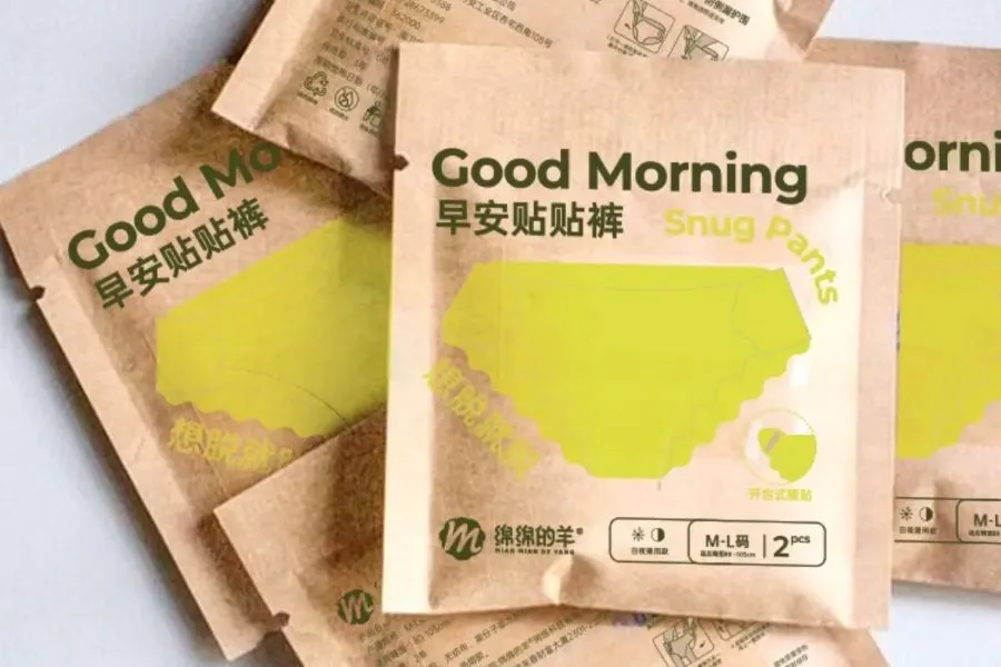 Sanitary underwear featuring minimalist packaging, with a design emphasizing simplicity.
Liu explains that during the packaging design process, she would typically begin with an initial discussion with the client to define the overall creative direction, including color, elements, graphics, and copy.
“The first round usually consists of two design proposals from which the brands could select their preferred option. One design would be developed from the client’s perspective, preferences, and aesthetic, and another that aligns with the client’s direction but is more driven by design principles and creative thinking.”
She also shares her design work on the Chinese lifestyle app Rednote, where stigma around menstrual health is being replaced by a greater focus on supporting for women.
“The packaging designs aim to not only reflect the product’s refined character, but also embody a sense of care, softness, and consideration for women, encouraging the embrace of the body’s natural changes,” she concludes.


