

Slice Design and Kupo bring Korean ready-to-pour drink pouches to UK and Gulf
Key takeaways
- Slice Design has developed new packaging and a refreshed brand identity for Kupo, a UK-based iced coffee and tea brand inspired by South Korean pour-over-ice drinks.
- The ready-to-pour pouches feature bold graphics, multilingual instructions, and a cup mascot to introduce the unfamiliar drinking concept to consumers in the UK and Gulf markets.
- The design studio also created merchandising units inspired by South Korean convenience stores, supporting the three-step “Pour. Chill. Go.” experience.

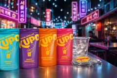 (All image credits: Slice Design).
Slice Design has created a packaging design and a renewed brand identity for Kupo, a UK-based iced coffee and tea brand by The Convenient Cube and inspired by South Korean pour-over-ice drinks in a pouch.
“The ready-to-pouch format was important in staying true to the original Korean concept while giving us a unique and distinctive format for the brand,” a spokesperson for Slice Design tells Packaging Insights.
“It also provided a much bigger canvas for our branding and communication. From a sustainability perspective, we have introduced collection at the point of use as they do in South Korea.”
Kupo targets markets in the UK and Gulf Cooperation Council region as an initial priority, prompting the packaging design studio, based in London, UK, to create packaging that explains South Korea’s pour-over-ice drinking culture to international markets, while maintaining the original design.

“The biggest challenge was education. We needed to make a new and unfamiliar way of drinking accessible to international consumers,” the spokesperson explains.
“It was important that the packaging was simple, with clear instructions and visual cues to explain how the product worked, while also introducing consumers to the experience and ceremony behind it. We wanted people to understand it instantly but also feel curious enough to try it.”
Ritual through packaging
Slice Design explains that Kupo’s coffees and teas in ready-to-pour pouches allow consumers to choose their flavor, pour over ice, and drink on-the-go. The initial range includes the flavors: Vanilla Latte, Sweet Americano, Salted Caramel Macchiato, and Peach Iced Tea, with multilingual packaging to support the international launch.
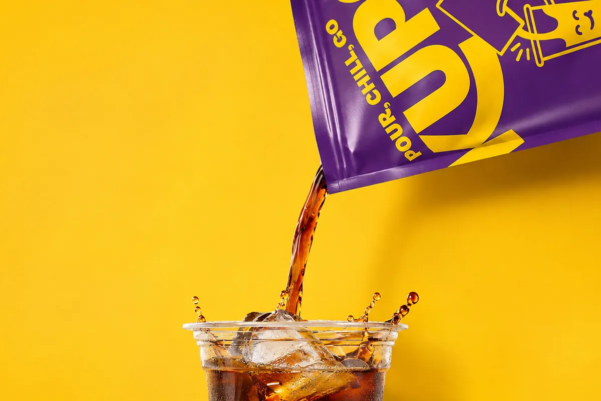 Slice Design uses bold graphics to explain Kupo’s Korean-inspired drinks.Dev Dhillon, brand owner at The Convenient Cube, says: “What sets Slice apart is their understanding of how design works in the real world, not just how it looks. From shelf standout and merchandising to communicating a new product concept at the point of purchase, they understand the practical and commercial challenges retailers face.”
“It's been a collaborative and fun process, with plenty of healthy debate on the design direction. The result is a brand that looks great but, just as importantly, is designed to work hard in retail environments in our target markets.”
The Slice Design spokesperson continues: “We spent time in South Korea with The Convenient Cube looking at beverage packaging, retail environments, and consumer behaviors to understand the culture around food and drink. What stood out was how bold and unapologetic the packaging was, with a strong focus on multi-sensory experiences and product interaction.”
“We were inspired by the convenience-store workstations, where consumers are encouraged to unpack, prepare, and dispose of their food and drinks. This hands-on experience and sense of ceremony really influenced our thinking, not just in the visual design of the packaging but also in how we approached the overall consumer experience.”
Alan Gilbody, founder and director of Slice Design, also comments on the perspectives the two companies gathered in South Korea: “The insights we gained on the trip helped shape our approach, creating an identity that captures the energy and appeal of this distinctive way to enjoy beverages.”
“It was important that the packaging did more than simply stand out on the shelf; it needed to communicate the concept clearly, educate consumers, and encourage them to get involved.”
Visual inspiration
Slice Design highlights that South Korean visual culture influenced its choice of colors, graphics, and typography across the Kupo packaging, adding that the design team had to balance a playful design with clear communication.
“For us it was about creating something that attracted attention but also educated consumers straight away,” the company spokesperson continues. “Our brand strapline immediately explains how to interact with the product, while our Kupo character demonstrates the pouring process and communicates the mood of each drink. This allowed us to make the instructions simple, visual and fun.”
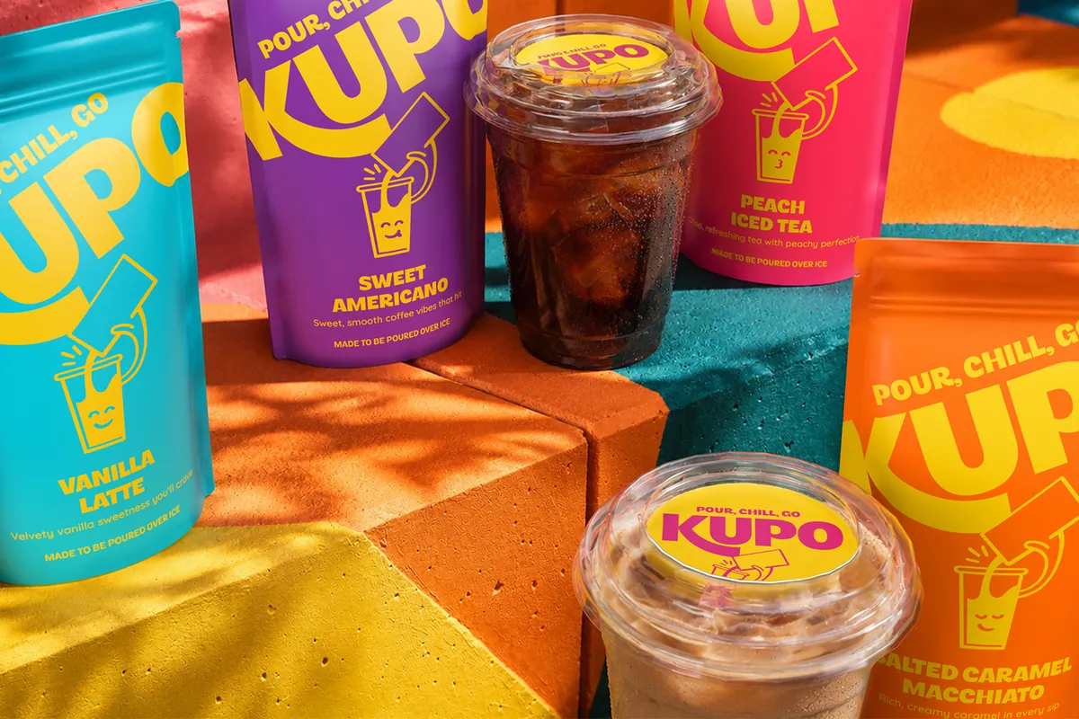 Slice Design draws inspiration from South Korean convenience-store culture.Simplicity and clear communication were key to developing packaging that could appeal to consumers across different markets like the UK and the Gulf region.
“We used simple instructions and iconography, alongside our Kupo character, which can communicate through speech bubbles in different languages as they do on the back of the pack,” the spokesperson elaborates.
“We also developed a simple three-step guide on pack and merchandising units, with further information on the back explaining the product ceremony and encouraging consumers to get involved.”
Slice Design sees packaging and merchandising working together to build awareness and encourage trial of this new beverage concept to the UK and Gulf region.
“They were designed to work hand in hand. The merchandising unit takes inspiration from Korean convenience-store workstations, with dedicated spaces for the pouches and Kupo ice cups underneath in the freezer, a space for holding the cup during preparation, and disposing of the packaging.”
“It enhances the overall product experience, offering an exciting, refreshing new way to consume beverages on-the-go. It also provides a larger space to demonstrate how the product works and create a memorable, shareable moment.”